We pharma creatives often have a slightly different hill to climb when it comes to creating brand campaigns. The concept of a campaign with multiple executions all pivoting off one central thought, like consumer campaigns, is hard for many pharma clients to get their heads around.
History has proven to them that one ‘key visual’ plastered across everything is the very thing that’s needed.
When I first started in healthcare I fought hard against this. It felt like a relic from the 60’s.
My pitches were full of multiple executions, riffing on an idea, because that was what I was taught to do in consumer adland, and consequently I think much of this was lost on the blank faces staring back at me.
That’s not how we do it, their expressions complained. But I ploughed on regardless. They must learn!!
So, rather against my better instinct but in the spirit of ‘if you can’t beat them join them’, here is one argument for embracing the key visual approach.
After a while of flogging a lot of dead horses I realised that there is a parallel in consumer advertising that was helpful to me to change my perspective.
It’s movie posters.
But how Olly?
Launching pharmaceutical brands is a lot like a movie launch. The majority of the spend is upfront. You need one memorable image that tells the whole story in one hit, that is broadly translatable across many territories and touches a global human truth.
Movie posters rarely manage that these days but there was a time when they ruled the billboards, were iconic and even collectable.
It’s an old reference (obviously) but I bet if I asked you to think of the poster for JAWS you could pretty quickly picture it in your mind. Nearly 40 years on and it’s still an deeply striking image, it still conjures up the horror of the movie and does it without any blood or gore, while capturing perfectly the suspense. You can almost hear the der-der music. Nobody had seen anything like it back in the 70s.
That’s the argument for the defence.
Now try and think of the JAWS 3 poster. Struggling?
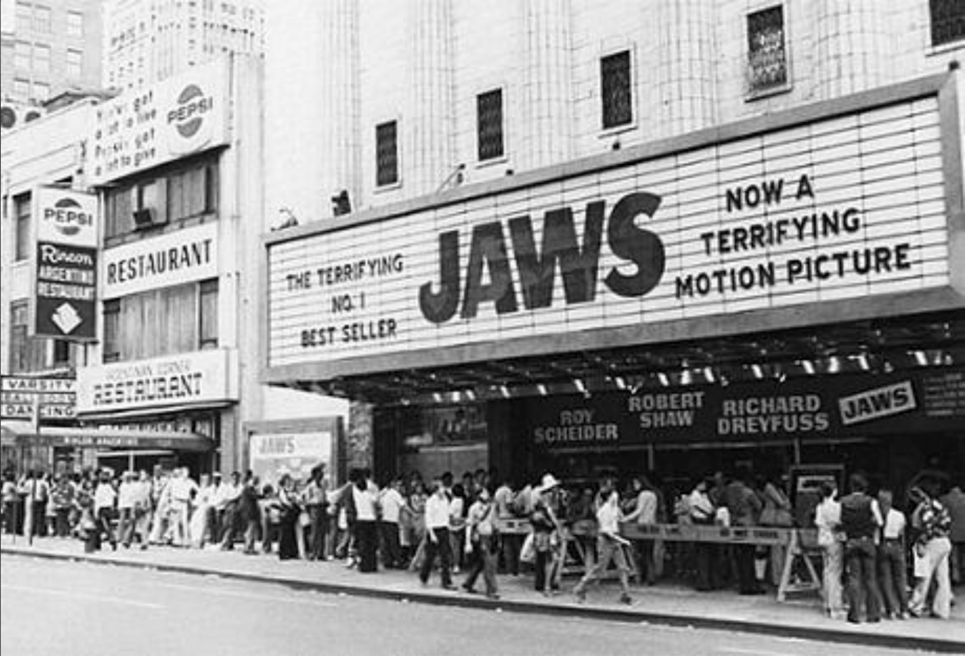
As someone who watched the original movie in the cinema (yes I am that ancient) it’s hard to recreate nowadays the impact that movie had on the cinema-going public. It’s often described as the first block-buster. Suddenly millions were going to see a film rather than thousands and every movie company wanted a blockbuster to match.
I remember being on holiday in Greece with my family and as we were all diving off a boat on one of those day-trips you can charter, my little sister (probably about 14 at the time and hadn’t even seen the movie yet) swam over a dark patch of seaweed. Despite sharks of any kind being almost unheard of in Greece, let alone Great Whites, she suddenly went in to a panic and started thrashing around convinced that she was about to be devoured. (Precisely what not to do if you see a shark by the way).
Sharks were so pervasive in the world’s subconscious that summer that sparkling clear water in secluded Grecian coves were potentially now the hunting grounds for 20ft long killing machines. The sea became unsafe overnight.
She was fine by the way.
What was left of her.
So let’s look at the first iconic poster that helped create all the buzz.
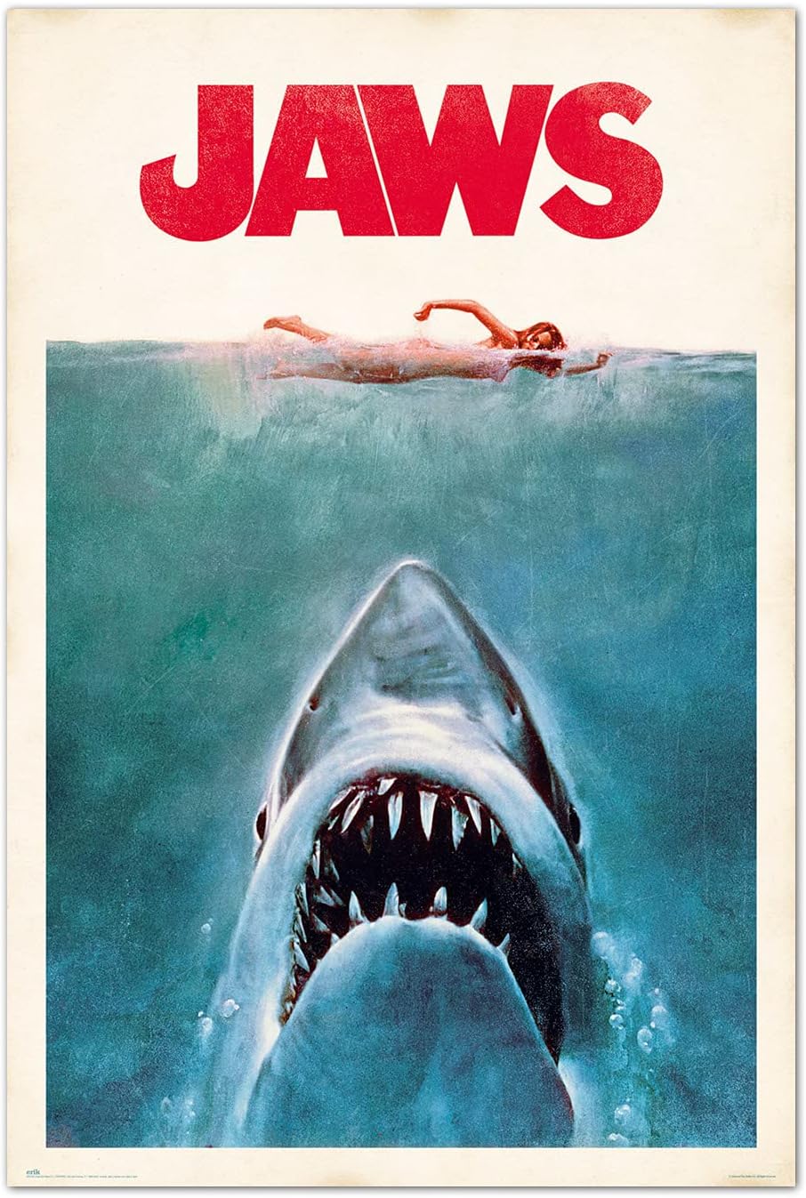
It fitted all the criteria for a pharma brief for a key visual. Impactful, simple, graphically appealing and globally understandable. And just one word!
Granted, it’s not the kind of thing pharma companies would do for a product, (but not unheard of for disease awareness.)
“Can we make it more positive?”
I don’t know about you but if I had designed this I would be pretty chuffed with myself. And it’s barely campaignable in the sense that we understand it in an advertising context. Yet great advertising it is (or was).
I remember once visiting the movie poster creative dept that was in a wing of Dorlands (at least i think so…it’s a long since defunct agency from back in the day) and they specialised in all things movies. It was a different atmosphere completely to most creative depts, more akin to a crusty graphic design agency. And it was much like a pharma agency, in that I am not sure they were respected by their consumer cousins at all.
Ok, so we agree the JAWS poster is a brilliant one-off key visual.
The problem comes when the client wants a little ‘refresh’. New indications or new data has come out and we’d like you to retain what made that first poster so impactful but add in some new details.
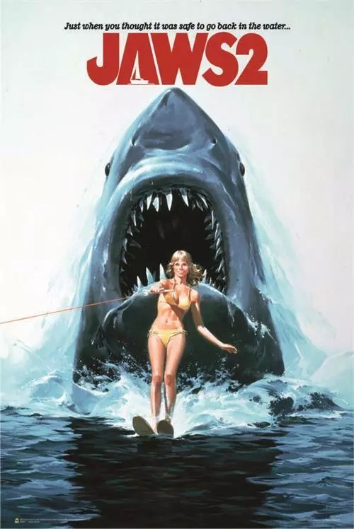
Ok, not bad. Still got the essence of Jaws 1. The waterskier is a nice addition. But the whole thing starts to feel less believable. Giant sharks taking down waterskiers? Ok maybe.
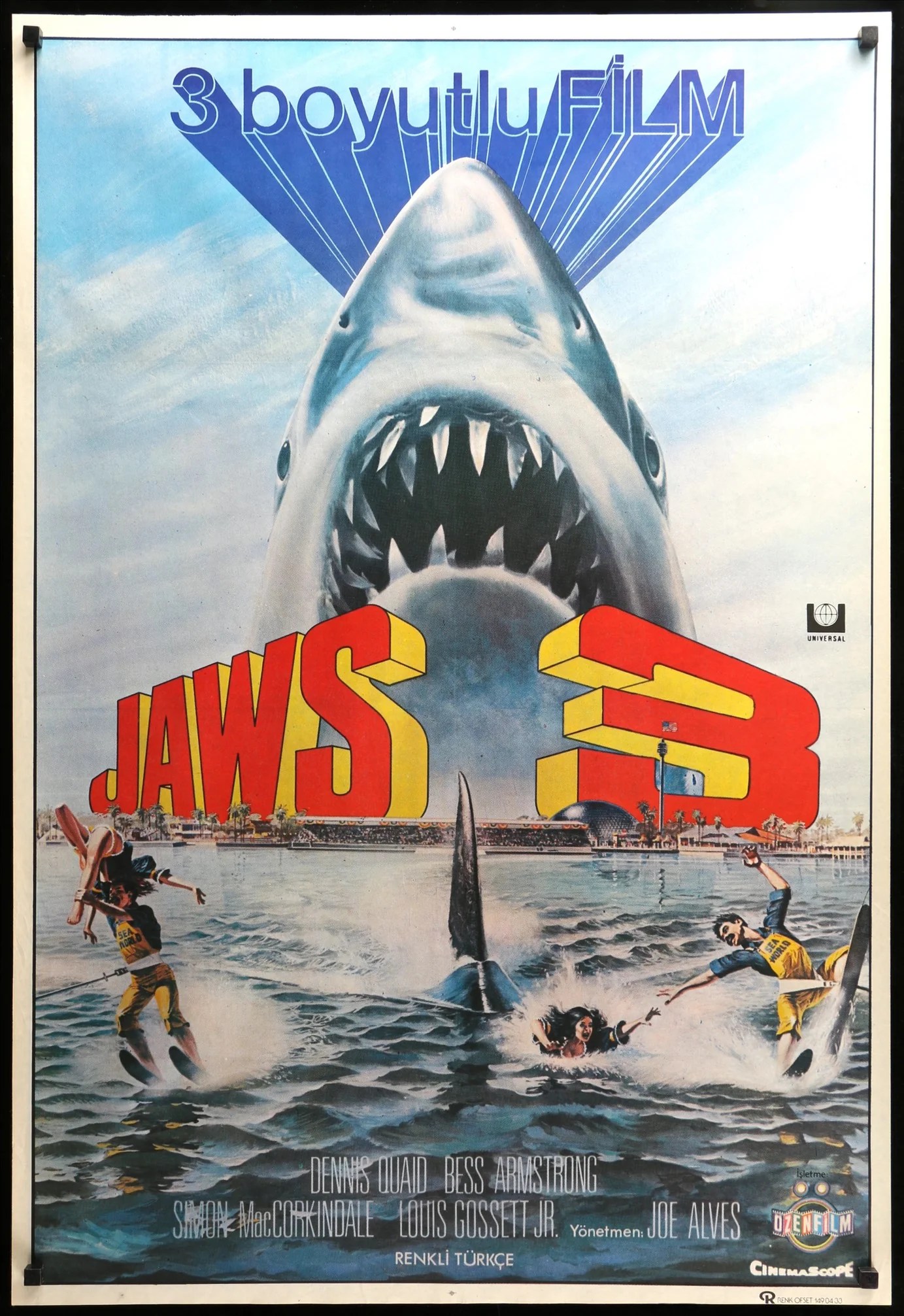
The next indication has a lot of bells and whistles. Can the team make it feel really different but also still the same ‘brand’.
Leaving aside the awfulness of this 3D movie, you can see how the campaign-ability is really stretched paper thin. It lacks the impact of the original poster and is now straining to tell a different story than the original. Without the big shark it would be hard to tell it from a movie about waterskiing accidents.
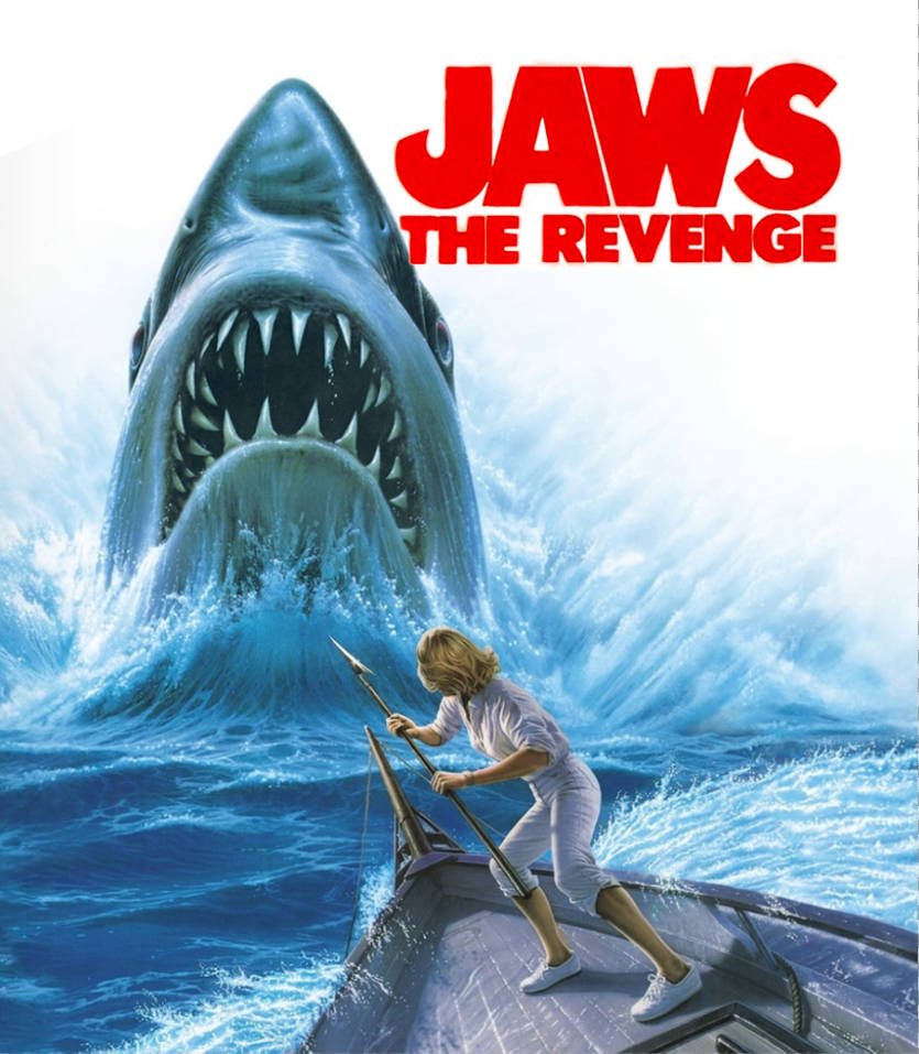
Jaws 4- still sticking with the big shark but it doesn’t really tell me anything different. The laws of diminishing returns has really kicked in here.
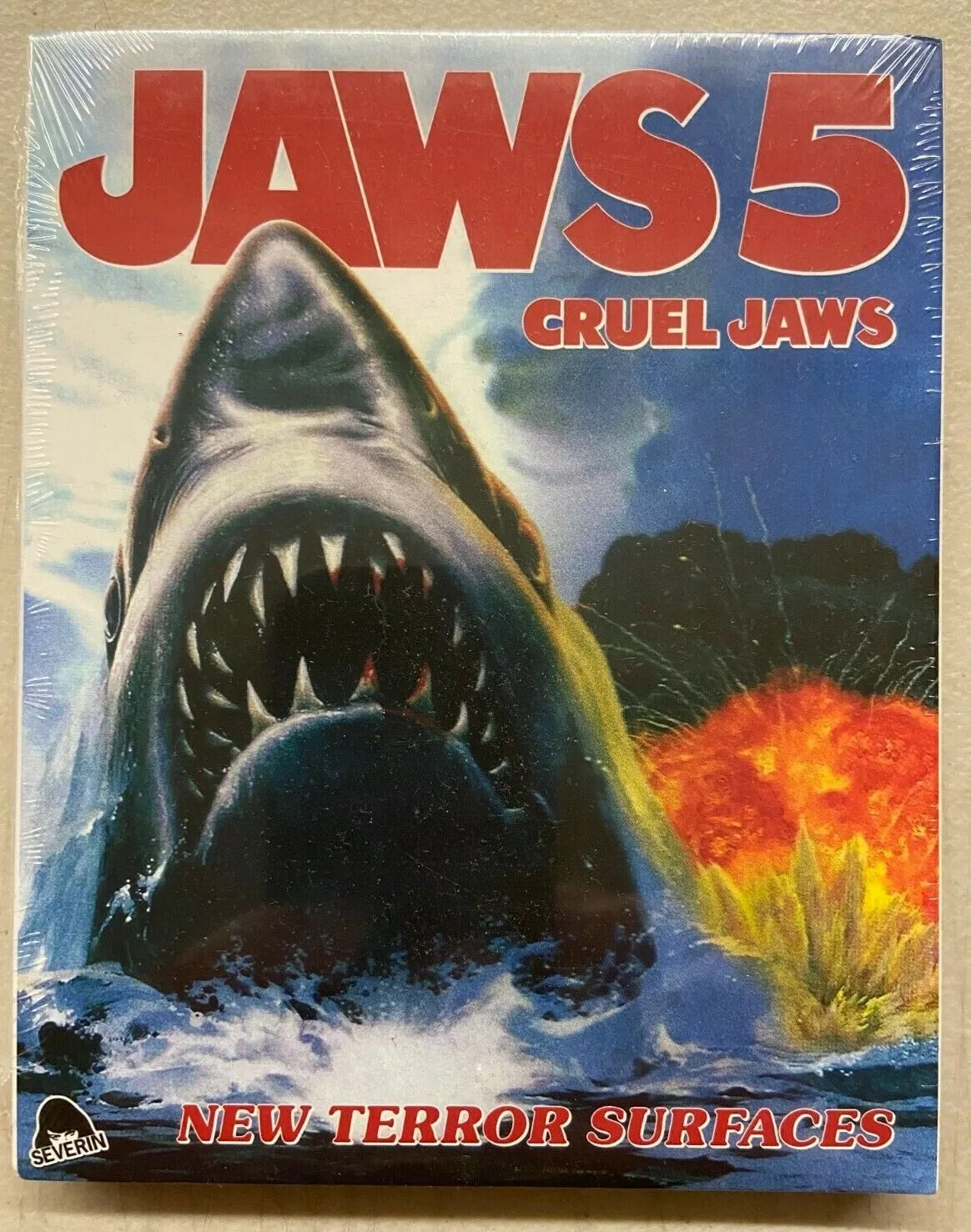
I am not even sure if this is a real movie, but Jaws 5 has pretty much given up on originality. Hardly any new data and a campaign that has become meaningless. Something to do with explosions?
So – conclusions?
I am still a fan of a big idea. A concept that is based on an insight, that can be recognisably part of the same campaign whether it’s a poster, digital or social content or a radio ad. I will continue to fight that fight.
But the key visual does have it’s place in the pharma universe, clearly.
Clients just have to realise what they sacrifice for impact and global resonance for a big launch they lose the notion of a concept in the truest sense.
When you think of all the consumer campaigns that used to run for decades, you realise that all the hard work is done up front and each subsequent creative working on the brief already has the job half-done. It makes it so much easier for clients and creatives alike.
Trying to reinvent one image over and over is almost impossible.
However the ‘key visual’ I am sure will survive long after I’ve gone. All you have to do is swop in different regional ethnicities for a global campaign and maybe change a few bits of furniture and you’re done.
And let’s not forget the growing presence of Gen AI. The potential for different iterations will be boundless. So maybe future creatives (IE: next year) won’t have to struggle to eek more versions out themselves. Just a few prompts and you’re done.
But for me it’s like eating at MacDonald’s every night.
It’s convenient and delicious and value for money.
But it’s just not that nourishing.

Great article and read Olly and so true. I’ve also come from a consumer background and don’t think Pharma marketers will ever think like the top FMCG marketers. That one key visual idea ain’t moving anytime soon, I don’t think. The whole process of interrogating the brief, finding that insight (or that ah-ha moment), getting under the skin of the end user and creating that idea / campaign that the brand will live and breathe for years is what will make that brand famous.
And you are right, AI will probably lend itself nicely to the KV concept? Who knows what the creative output will look like in 5-10 years time when AI will be answering most creative briefs. God help us all.
Have a good Friday.
Suzanne
Thanks Suzanne – your feedback is much appreciated!